Those Two Sisters had built a successful coaching business through resourcefulness, personality and a lot of DIY effort.
But as the business matured, the brand lacked the consistency and structure needed to support its next stage.
THE CHALLENGE
The original name tied the business closely to its two founders.
That worked while they were the whole brand, but it could limit future growth into a broader coaching system, community or team.
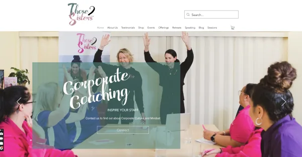
The visual identity also needed to evolve from youthful and homemade to polished, credible and ready for a more established audience.
Before:
A PROVEN BUSINESS HELD BACK BY A DIY BRAND
Profit and peace, with room to grow beyond the founders.
We refined the name to Those Sisters and centred the positioning on a useful tension: profit and peace, success and humanity, polish without pretending life is perfect.
THE STRATEGY
We refined the name from Those2Sisters to Those Sisters.
The shift kept the warmth and familiarity people already knew, while opening the brand to more women, more coaches and a larger movement.
The positioning centred on a powerful tension:
Profit and peace. Success and humanity. Polish without pretending life is perfect.
THE CREATIVE DIRECTION
The identity needed to hold both sides of the brand.
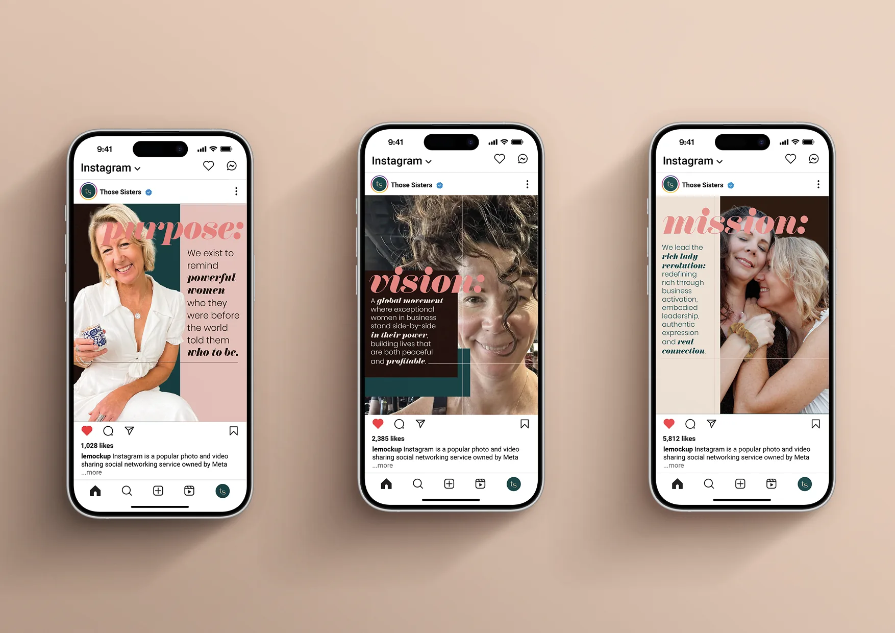
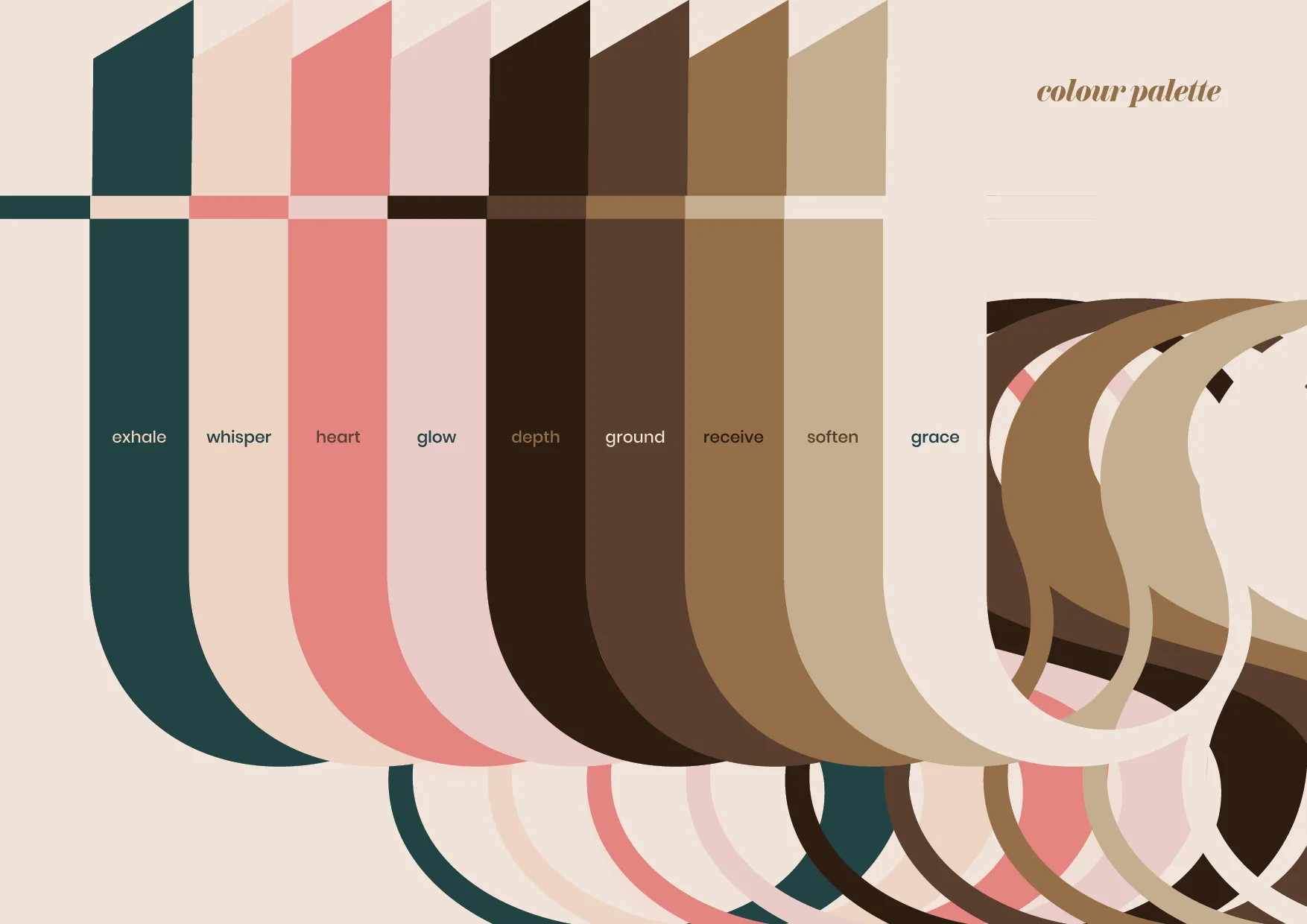
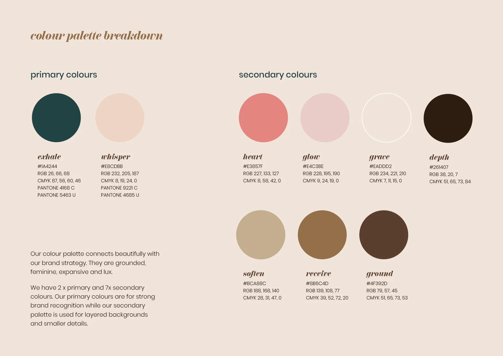
Rich neutrals, deep green and soft feminine tones created maturity and warmth. Clean structure and strong lines brought authority, while layered shapes, expressive typography and playful details kept the brand human.
Barefoot to boardroom. Vinnies to Versace.
WARMTH WITH STRUCTURE. PERSONALITY WITH ROOM TO GROW.
We used warm, feminine and grounding tones that were based on the original brand colour palette, but giving it more depth and usability.
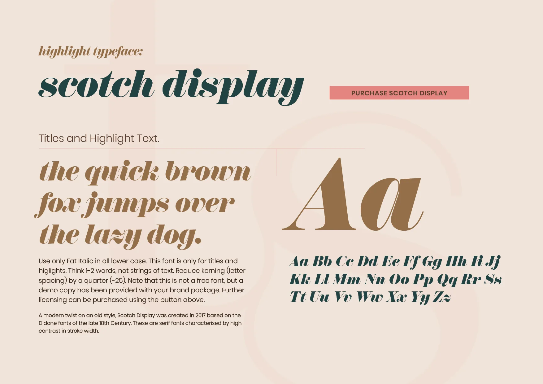
Typography pairing of a simple sans serif with an elegant display font allows for readability and playfulness.
We used layered lines and rectangles to depict the layers we all embody. It shows the tension those different parts cause and reality that life is messy but beautiful.
THE TRANSFORMATION
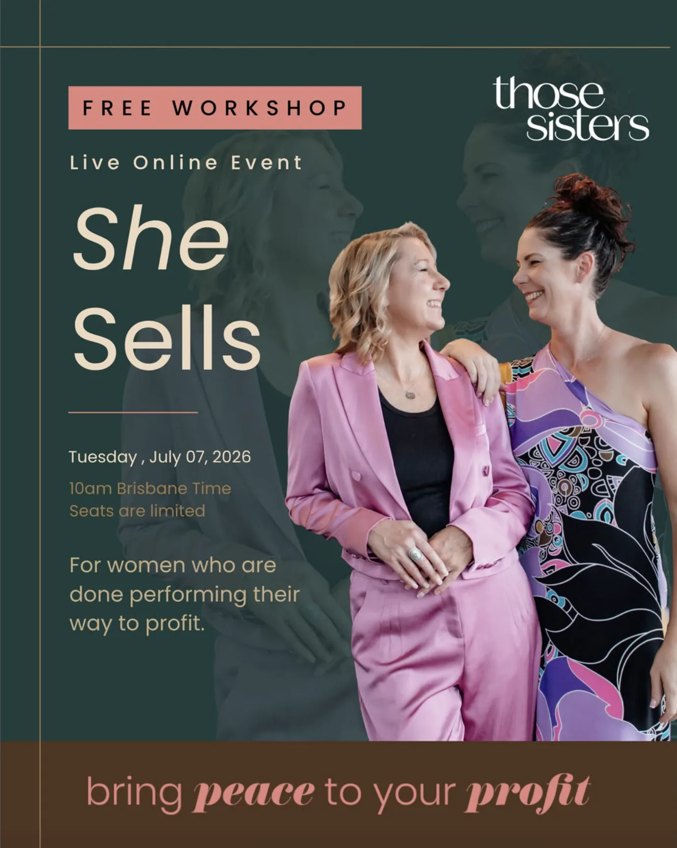
Those Sisters moved from a founder-led DIY brand to a cohesive platform built for expansion.
The result is polished without being pristine, feminine without feeling girlish, and powerful without losing the honesty, humour and real connection at the heart of the business.
A brand spacious enough for the movement they are becoming.
A MODERN, SOPHISTICATED BRAND BUILT TO GROW BEYOND TWO FOUNDERS
If your business could thrive with a brand system like this, we’d love to help you with it.