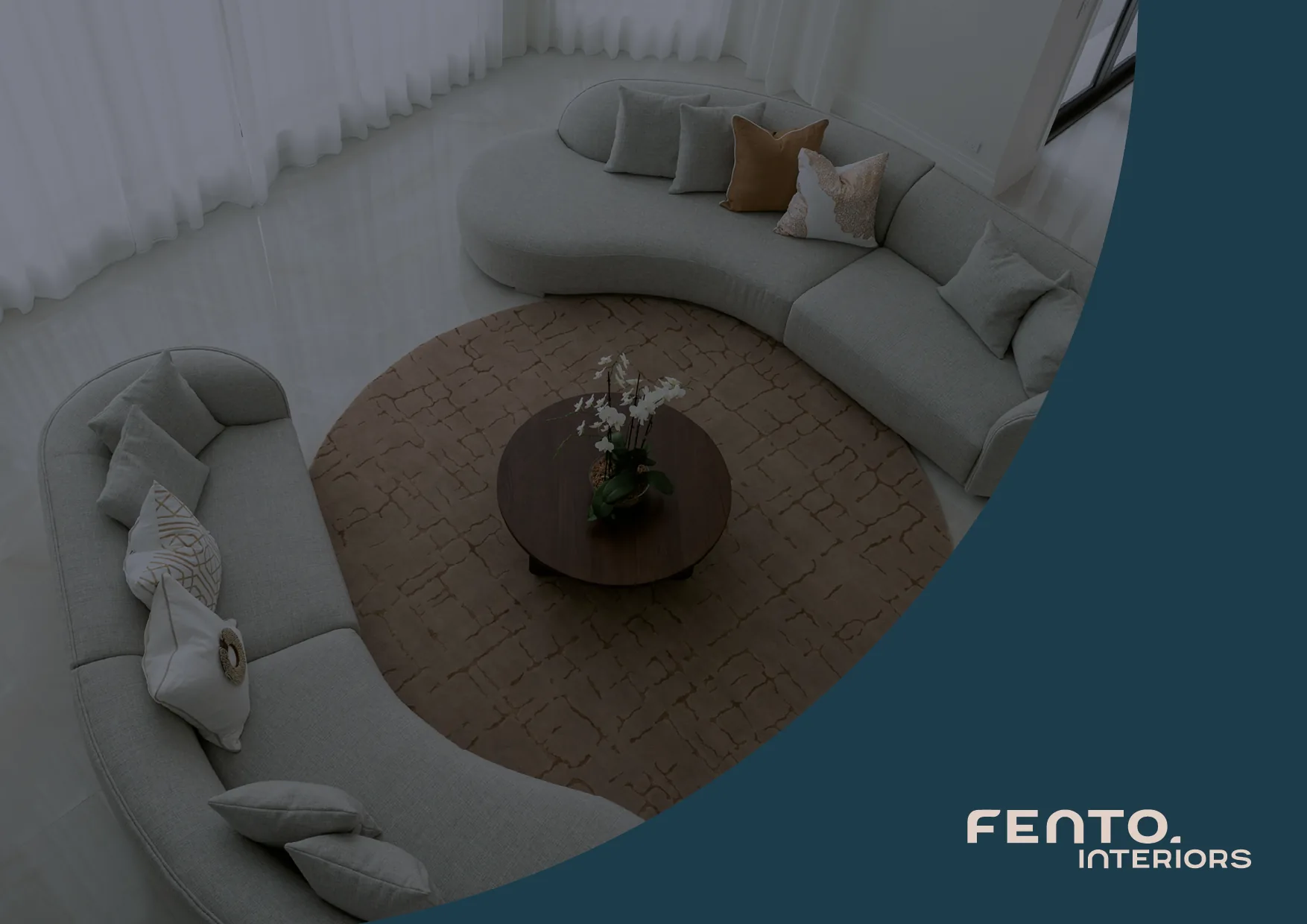
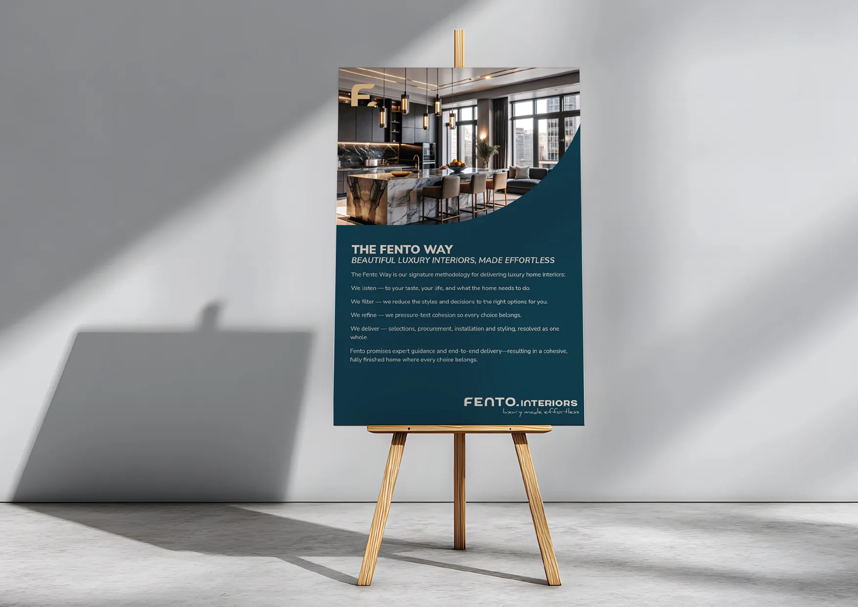
FENTO INTERIORS LUXURY MADE EFFORTLESS.
SOLUTIONS: POSITIONING / VISUAL IDENTITY
THE STARTING POINT
Fento Interiors wasn’t a new business.
It was an established interiors studio with experience behind it, but after changing its name to Fento Interiors, the business needed a brand that reflected where it wanted to go next.
The existing identity had become too pretty, feminine and decorative for the market Fento wanted to pursue.
The business had evolved. The brand needed to catch up.
THE CHALLENGE
Fento wanted to attract a very specific new client: single men investing in creating a home that felt considered, sophisticated and complete.
Couples and downsizers would remain important audiences, but the new brand needed to make sure men could immediately see themselves in it.
That meant stripping away the visual cues that often make interior design brands feel overly feminine, without losing the premium, stylish quality expected from the industry.
LUXURY WITHOUT THE DECISION FATIGUE.
THE STRATEGY
Fento’s strongest growth opportunity sat with clients who valued great design but didn’t necessarily identify with the traditional world of interior decorating.
The brand needed to make professional interior design feel relevant to them.
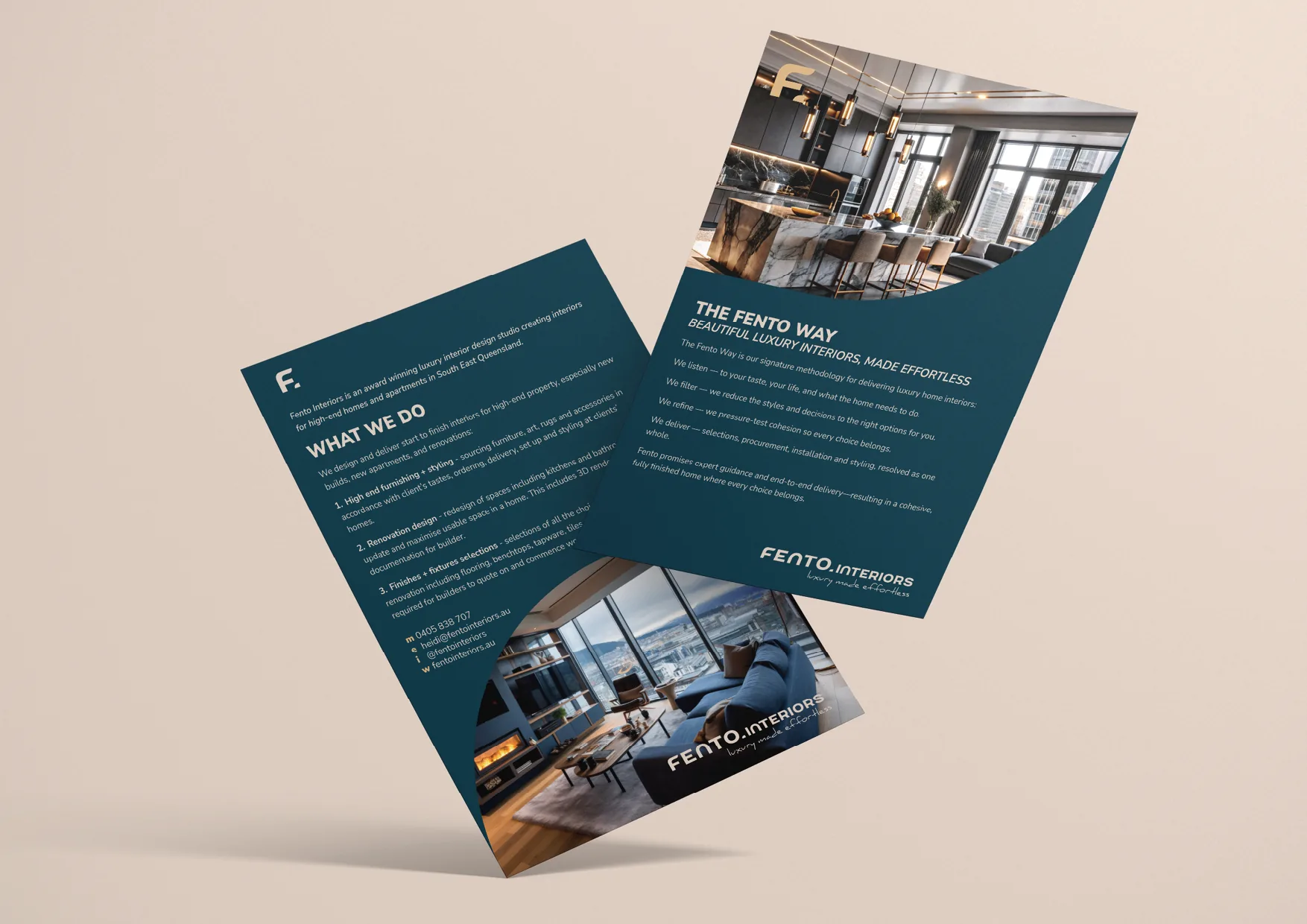
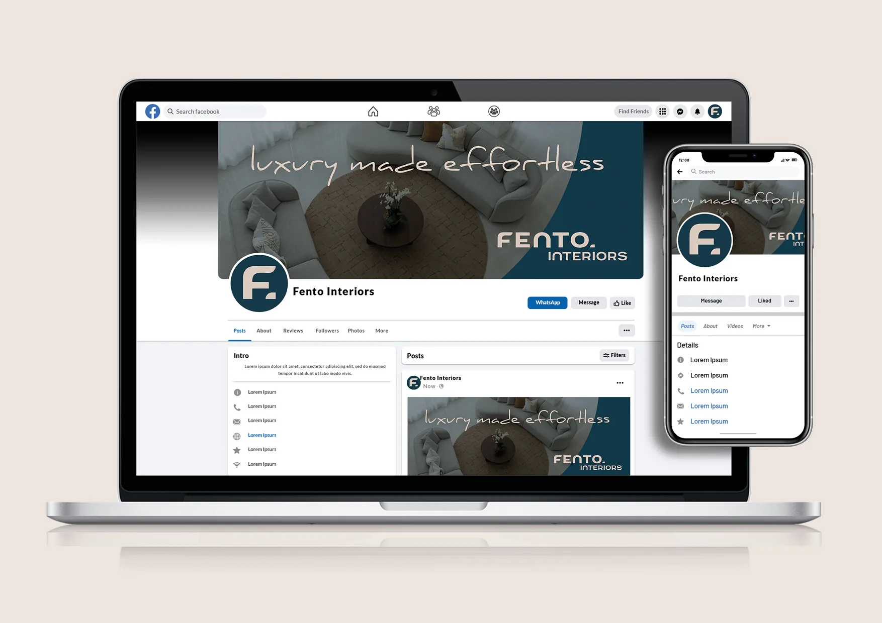
We focused the identity around simplicity, confidence and restraint, creating a premium presence without unnecessary decoration.
The result was designed to feel sophisticated enough for high-end interiors while remaining clean, grounded and easy to engage with.
THE CREATIVE DIRECTION
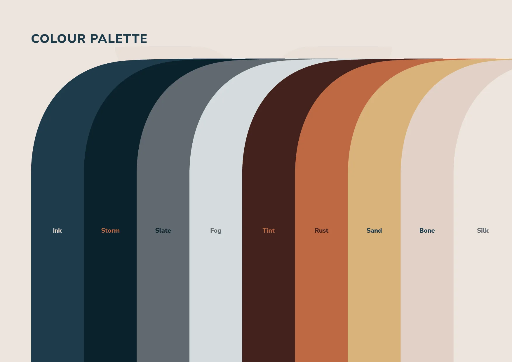
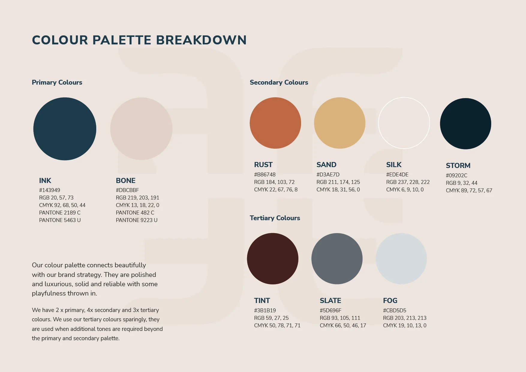
The colour palette was deliberately neutral, with a subtle masculine edge.
Rather than soft, decorative colours, the palette gives the brand a more grounded and architectural feel, helping Fento appeal to its priority audience while still sitting naturally within the interiors space.
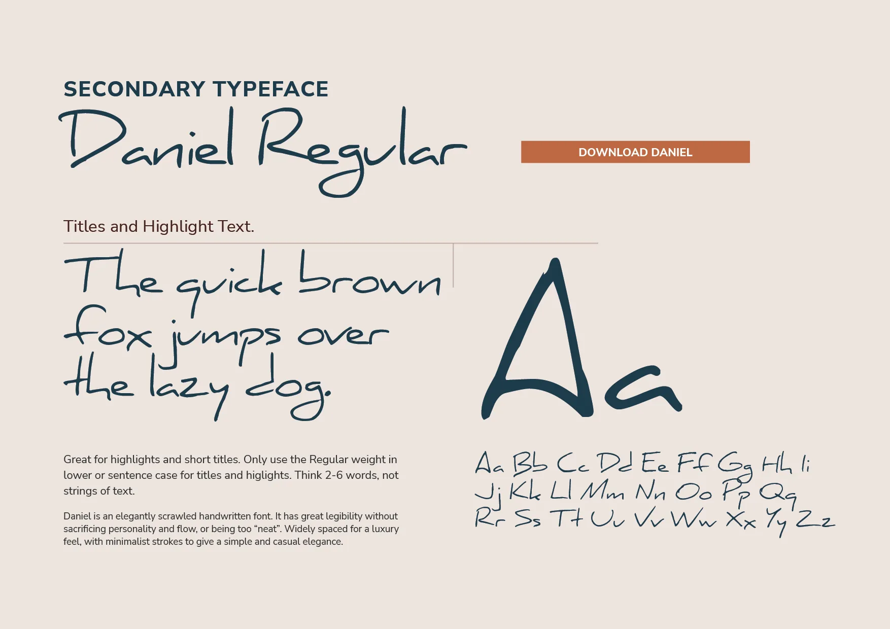
Typography follows the same thinking.
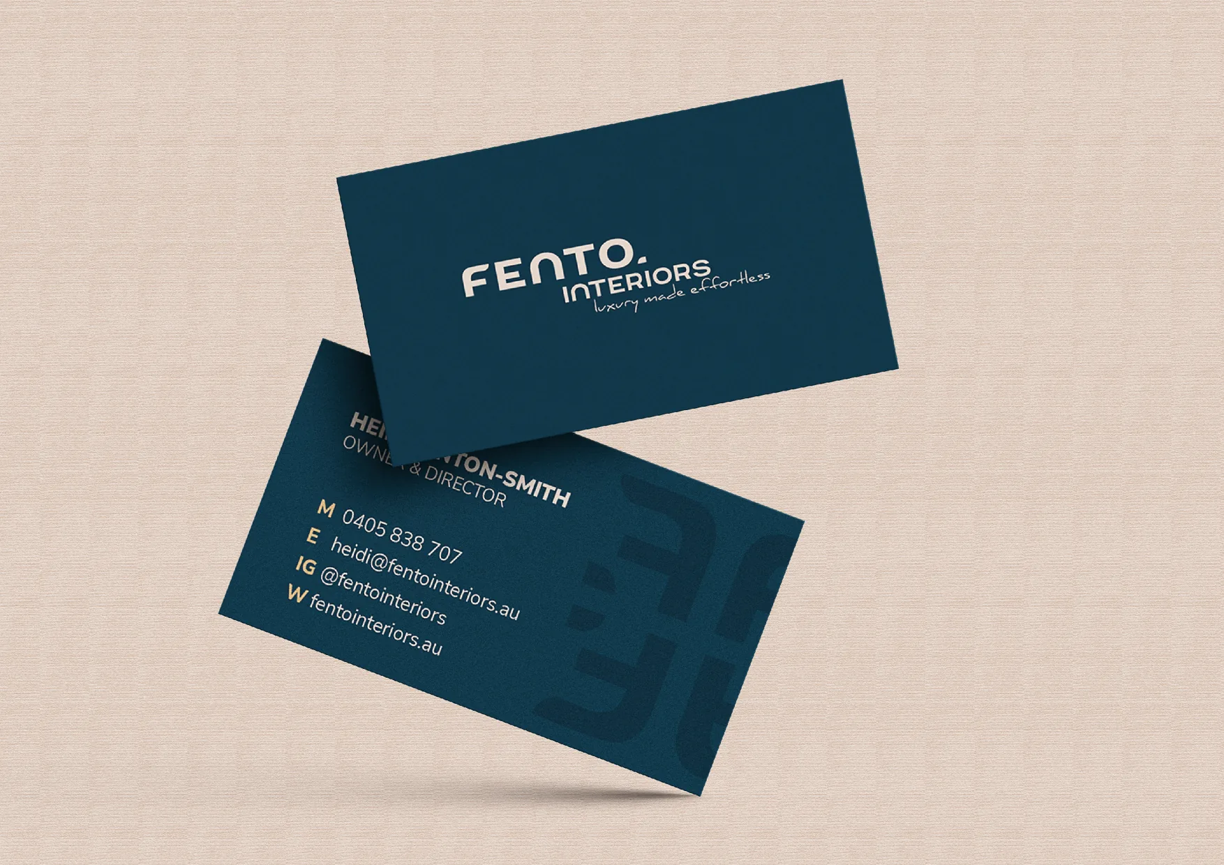
The core letterforms are simple, stark and blocky, giving the brand a strong, no-fuss foundation. The customised F is the exception, introducing a distinctive curve and just enough personality to make the identity recognisably Fento.
That contrast became an important part of the brand: structure softened by a considered detail.
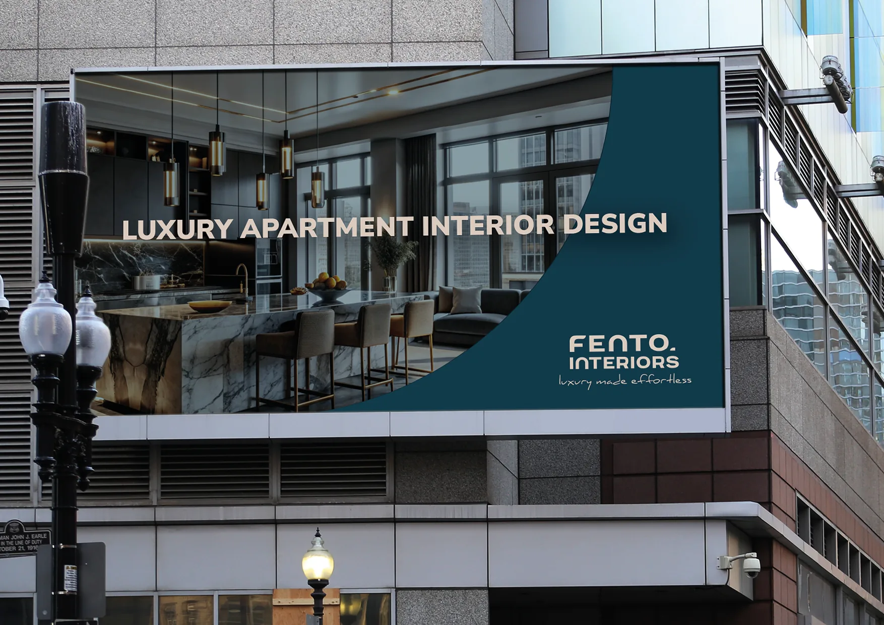
THE TRANSFORMATION
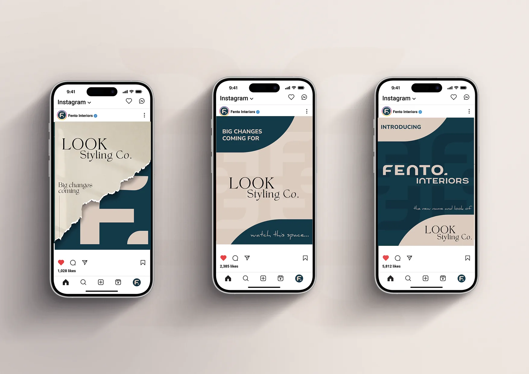
The new identity gave Fento a brand that finally reflected the business it wanted to become.
Instead of being visually tied to its previous audience, Fento could confidently pursue the clients and projects that represented its next stage of growth.
The brand now felt aligned with the market it wanted to attract: sophisticated, design-conscious clients who valued expertise but didn’t want the frills traditionally associated with interior design.
Fento could show up as the business it already knew it was.
DESIGNED FOR WHERE THE BUSINESS WAS GOING.
The rebrand gave Fento more than a new look.
It gave the business permission to move into a different part of the market, backed by an identity that made that direction feel credible from the first impression.
Does you brand still look like it’s for someone else? We love repositioning brands to make you more money.