OMNI FLOORING FLOORS, SORTED.
SOLUTIONS: BRAND STRATEGY / VISUAL IDENTITY
THE STARTING POINT
After years in the flooring industry, Omni’s founder was ready to build a business of her own.
The challenge was creating a new brand that could earn trust quickly and stand confidently beside established retailers.
THE CHALLENGE
Flooring can feel complicated.
Too many choices, technical decisions and moving parts can leave customers overwhelmed and unsure.
Omni needed to offer a clearer, more supportive experience.
GUIDANCE FIRST. FLOORS, SORTED.
We positioned Omni as a customer-first flooring adviser, not another product pusher.
Not necessarily the cheapest way to buy flooring. But the easiest way to get it right.
THE STRATEGY
Omni needed to feel knowledgeable without becoming clinical, and established without becoming corporate. We built the brand around a warm, personal approach.
Rather than overwhelming customers with products and technical information, Omni simplifies the decision. It becomes the trusted person you call when you want confidence that everything has been considered and the job will be handled properly.
THE CREATIVE DIRECTION
The visual identity balances credibility with approachability.
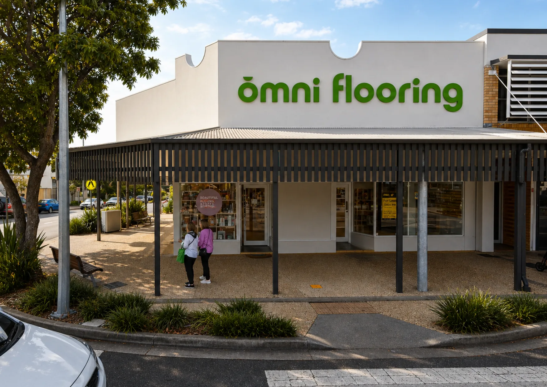
Belinda wanted a typographic logo rather than an overly conceptual or pictorial mark. The result is deliberately clean and established, with enough individuality to make it recognisably Omni.
THE BRAND SYSTEM.
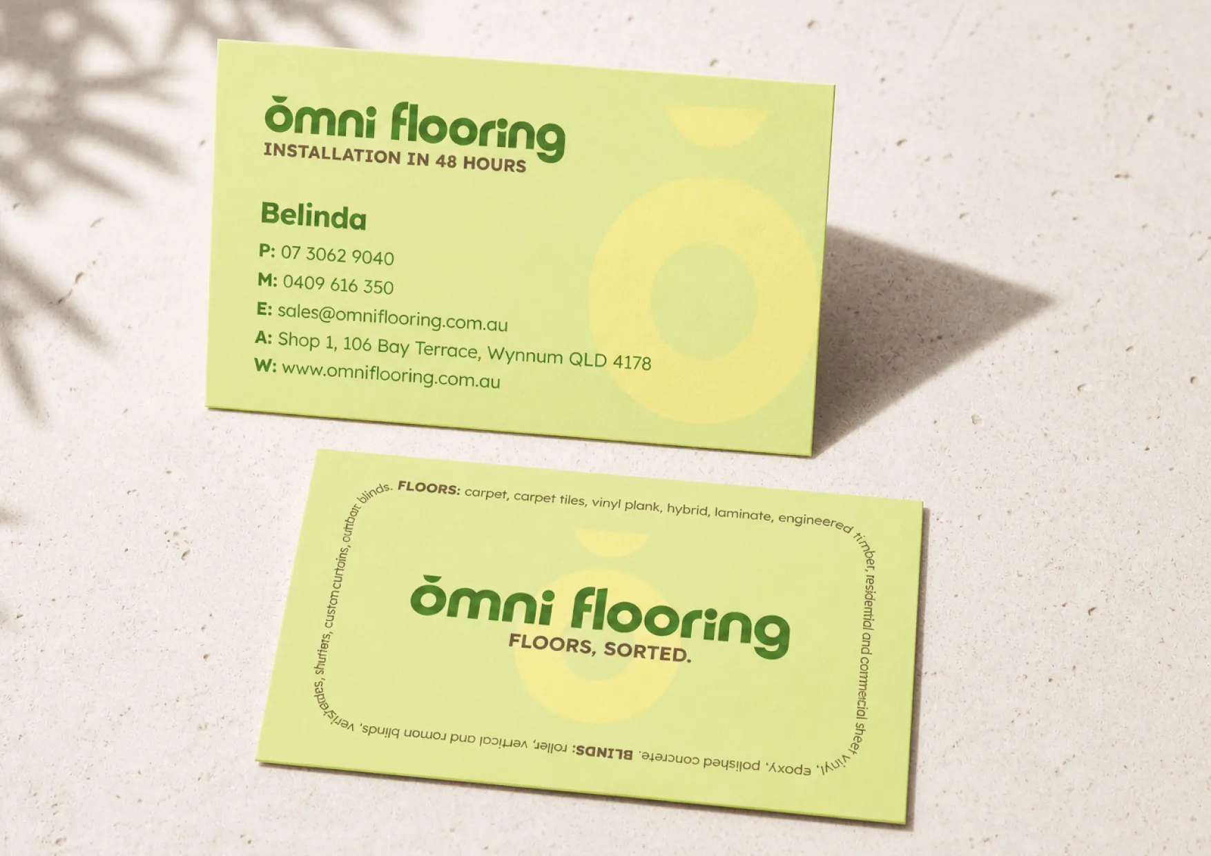
The rounded forms within the logo became a recurring part of the wider identity, helping soften the brand and reinforce its friendly personality.
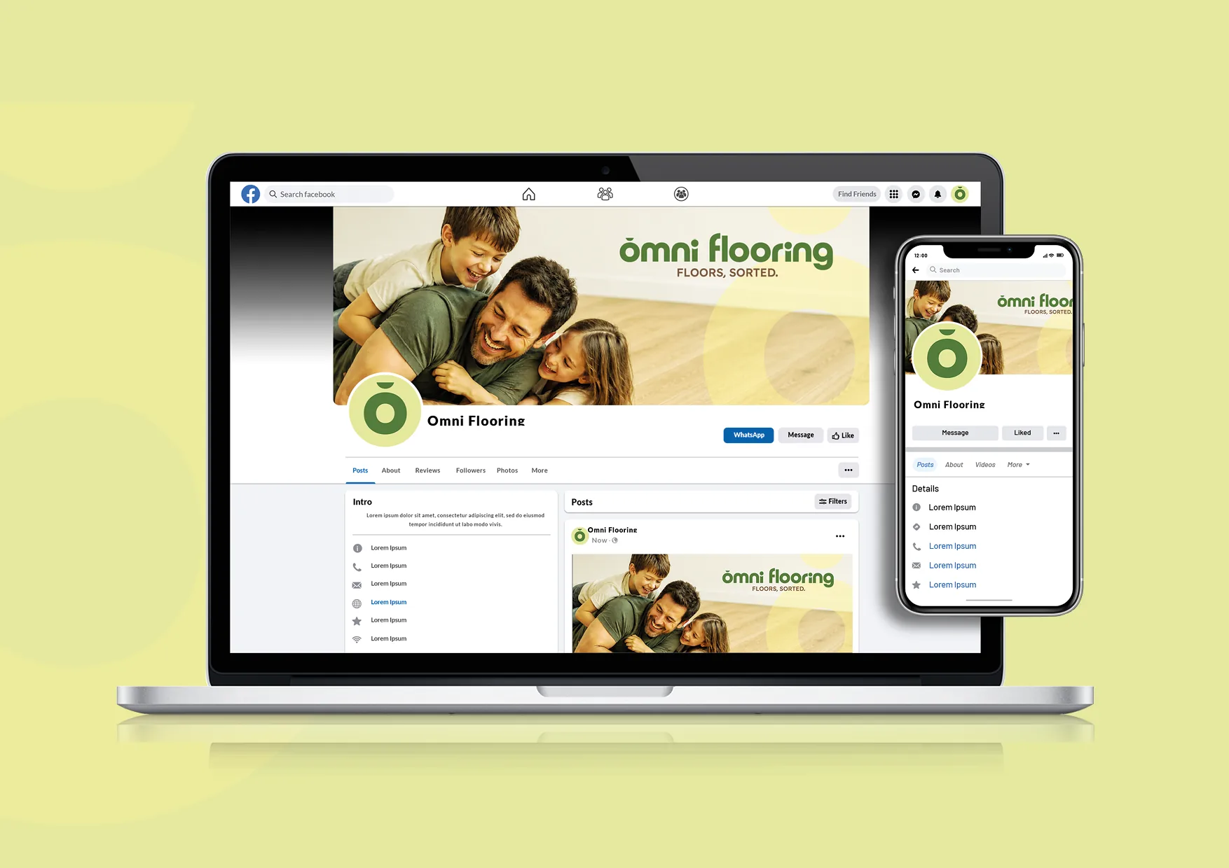
The Omni O expands into a bold background graphic across applications, creating a recognisable device that can carry through signage, advertising, print and digital marketing without relying on the full logo every time.
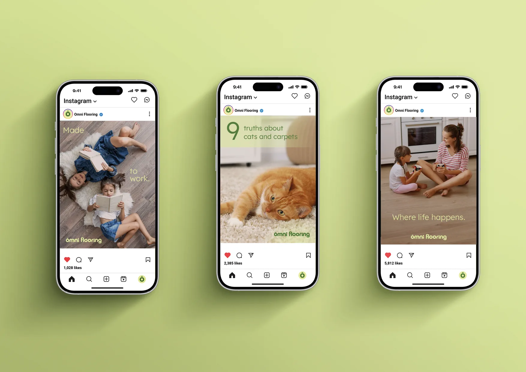
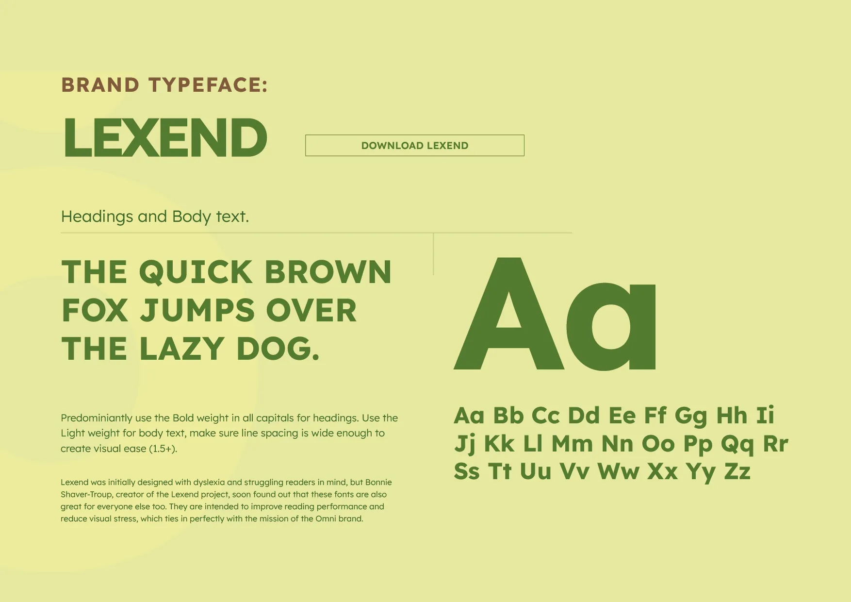
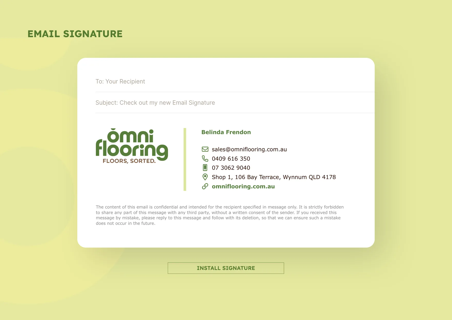
Simple typography, generous layouts and the natural colour palette keep everything consistent with Omni’s core promise: knowledgeable, straightforward and easy to deal with.
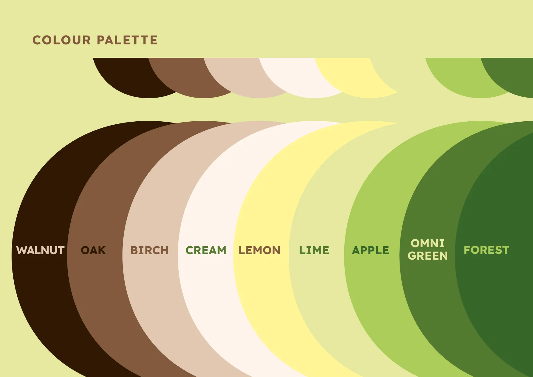
A calm green anchors the palette, helping the brand feel grounded, dependable and reassuring. Browns and creams draw naturally from timber, flooring and interior materials, while a yellow accent introduces a small hit of warmth and optimism.
THE TRANSFORMATION
Omni didn’t have to spend its first few years looking like a new business.
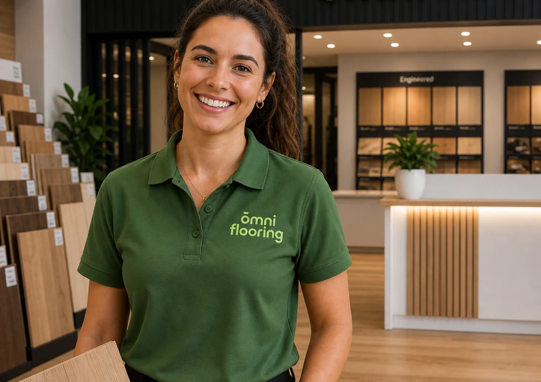
It launched with a clear position, a professional identity and a complete visual system ready to roll out across signage, advertising and everyday marketing.
That meant getting the name out into the market was never held up by branding decisions or inconsistent assets. Belinda could simply hand over the right files and keep moving.
The result is a business that looks established from day one, while still feeling personal, approachable and distinctly Omni.
ESTABLISHED FROM DAY ONE. READY TO GROW.
Omni began with deep industry experience and a better way of helping customers choose flooring. The brand turned that experience into something customers could recognise immediately: calm, credible and confidently sorted.
If something like this would work for your business, let’s talk.