5 AI Tools for Design

At the beginning of the year, a designer friend mentioned this new thing that was going to take away our jobs and ruin our industry. For a month it stayed in the corner of my mind and I quietly stewed on how scary that was (if it was true!), the unfairness of it and that I wish it didn’t exist.

Then I decided to learn about it.

What I found was a set of incredible tools. And like all tools, you must learn to use them effectively. So I started playing. Just like computers were in the 90s and just like Canva is now, Artificial Intelligence gives us an amazing opportunity to create even better design.

Today I use several AI tools in my business and I’d like to share a few of them with you.


1. Profile Picture Maker

Brand your profile image

This one is a bit of fun. Just take a selfie and upload it to the site. It will remove the background from any image (even if you don’t have a nice plain background) and give you a bunch of options to replace your background. What you should do, is get the hex code (a 6 digit code preceded by a #) of your main brand colour and use this for the background. Click Background then RGB and you’ll see the space to paste your hex code. Instant branding! Play around with the different textures and patterns, but make sure you choose something that is on brand for you.

To get your new profile pic, just hover over the image you like and click the green arrow. That badboy is in your downloads.

This is a perfect entry level AI tool. If you haven’t played with any AI, give this a go. It’s free, but you can pay to get some more advanced options.

pfpmaker.com


2. Background Remover

Take out that pesky background

Do you pay a Canva Pro subscription just for the background remover? I’m about to save you $15 a month*

*This tool is free whilst in beta, and was still in beta at the time of writing this article!

Just upload an image, remove background, download and then upload into Canva. Ready to go!

pixian.ai


3. Vectorizer

Make my logo bigger!

Designer jokes aside, if you’ve created your own logo in a tool like Canva, you likely won’t have a vector file of it. Image files like jpg or png are made up of pixels, when you scale them they lose quality and look “pixellated”. Vector files are made with an algorithm and are scalable to any size. Your signwriter or embroiderer will definitely want one of these. This is the professional grade file, with this you can put your logo on a banner, a billboard, or the moon.

Previously the domain of designers with expensive Adobe subscriptions only, vector files are now a click away with AI. Get the highest resolution image you have of your logo and upload it. The bigger the image, the sharper the result. Text will not always come out exactly right and there can be a little distortion for images as well. But overall, this tool does an incredible job. It’s better than the equivalent tool in Adobe Illustrator (live trace) and I use this all the time.

When you get to the downloads page, get yourself an eps file and a pdf. You likely can’t open the eps, but this is the professional file you send to your printer. Keep it on file, trust me. The PDF is a vector you can view and use more easily.

This is free while in beta too. Get your logo vectorised while it lasts!

vectorizer.ai


4. Image Upscaler

Make your photos bigger

Similar concept to the vectorizer, but this time with pixels. If you ever had a photo that was oh-so-perfect but low resolution, I have the solution for you!

The bot analyses your image, decides what it is and then uses thousands of other similar reference images from the internet to upscale your image with believable content. It does an excellent job of inanimate objects and food, pretty good with animals, but a little questionable with people.

For instance, I uploaded an elderly gentleman. He didn’t have glasses on before, but he did when the bot was finished with him! So many of it’s reference images wore glasses that it decided to give him some. He didn’t quite look like himself anymore either. In this case, I couldn’t use the image. But I was recently sent some food images for a cookbook I was designing and they weren’t very big. This tool did an excellent job of enlarging them so we could go ahead with the print job.

This is a handy one to bookmark and keep in your back pocket. Free as well!

create.pixelcut.ai/upscaler


5. Midjourney

Create anything you can imagine (and put into words)

This is the big baddy of the visual AIs. The one that was going to take my job and ruin my industry. I’ve had so much fun with this thing.

It takes a bit more setting up. You need a Discord account, then sign up to Midjourney and add the Midjourney bot to your Discord so you can talk to it. Discord reminds me of a 2000’s chat room. It basically is that actually.

Once you’re in a chat with the bot you type the command /imagine. Then let that imagination run wild. You can ask it for an image of the Queen and 50 Cent having a tea party in the gardens of Buckingham palace with corgis and flamingoes… and it will make it! It searches the internet for who and what those things are and creates you an image.

It doesn’t always nail it. In fact, here is a hilarious outtake. You can see from the cover image too that hands are also not its speciality.

Midjourney is no longer free, it’ll set you back $10 a month. Pay the $10. It’s worth it for a month of giggles (if nothing else).

In my business I use this for creating stock images and conceptualizing illustrations.

Instead of trawling stock image sites to find the perfect combination of objects, people, mood and colour, now I just ask for it. It can take a few goes and tweaking my “prompt”, but I can usually get a result. And faster than searching.

I can ask it for characters to give me ideas for illustrations, giving me another way to conceptualise and develop ideas. If the results are really good, we can put them into the vectoriser then take them into Adobe Illustrator to edit and play with.

Try it out.

midjourney.com


In conclusion

AI wasn’t so scary after all and I’m thoroughly happy with my choice to combat it head on. Now we’re not fighting at all, we’re good friends. If you’re new to this strange new world, I hope this has given you a chance to dip your toes and build some confidence with the technology. And if you’re an AI buff, I hope there was something here to peak your interest.

AI isn’t coming for your job, not yet anyway (it’s not that intelligent) but your job could be in danger from someone who is using these tools to their advantage. This stuff is designed to be easy as pie, have a play and see what you can find to make your life and job a little easier.

This article was surprisingly NOT written with the help of ChatGPT (though I do use that guy for many things!).

The Art of Balance in Graphic Design Composition

In the world of graphic design, composition is key. It is the arrangement of elements within a design that determines how visually appealing, engaging, and effective it is. And when it comes to creating harmonious and visually striking designs, balance plays a crucial role. In this blog post, we will explore the concept of balance in graphic design composition and why it is essential for creating impactful visuals.

Understanding Balance in Design

Balance in graphic design refers to the distribution of visual weight within a composition. It is about achieving equilibrium among various elements, such as shapes, colours, text, and images, to create a sense of stability and order. There are three primary types of balance in design:

  1. Symmetrical Balance: This type of balance is achieved when elements are mirrored or evenly distributed on either side of an imaginary central axis. Symmetry brings a sense of formality, order, and stability to a design.
  2. Asymmetrical Balance: Asymmetrical balance is achieved by distributing elements of differing visual weight but with similar visual impact across a composition. It creates a dynamic and visually interesting design while maintaining a sense of equilibrium.
  3. Radial Balance: Radial balance is achieved by arranging elements in a circular or radial pattern, with the focal point at the centre. It creates a sense of movement and energy, drawing attention to the centre while maintaining overall balance.

The Importance of Balance in Graphic Design

Here are a few concepts you can think about in your own designs to enhance your results.

Visual Hierachy

Establish a clear hierarchy and directing the viewer’s attention to the most important elements within the design. It helps guide the viewer’s eye through the composition, emphasizing key messages or focal points. This could mean making the most important elements bigger, bolder or in a more prominent position. Remember, most people read (and scan images) from top right to bottom left. So if you place something in the top right corner it’s more likely to be seen first.

Emotional Impact

Balanced compositions evoke a sense of stability, order, and professionalism. They can convey a brand’s values, aesthetics, and personality effectively. Different types of balance can also evoke different emotional responses; symmetrical balance often conveys a sense of calmness, while asymmetrical balance can evoke energy and movement.

Visual Weight

Elements in a design have varying visual weight based on their size, colour, shape, and contrast. It’s important to distribute these elements in a way that creates a sense of equilibrium. Heavier elements should be balanced by lighter or smaller elements to avoid visual imbalance. For example, putting heavier visual elements on top of the page can create an unstable look.

White Space

White space, also known as negative space, is the empty space surrounding and between design elements. Proper utilization of white space helps create a balanced composition by giving elements room to breathe and preventing overcrowding. The more white space you include, the more high end your design will look. If you’re having a huge clearance sale and want to advertise bargains and give a sense of urgency, you can omit white space and rely more on visual hierachy. Otherwise, do not underestimate the value of a little bit of nothing.

Alignment and Proximity

Grouping related elements together and aligning them properly contributes to a sense of balance. Elements that share visual characteristics or have a logical connection should be placed closer together, while maintaining an appropriate amount of negative space between different groups. Look at whether you’re aligning different elements in a strategic way. Is your text aligned to the top of an image, the bottom or centre? How does that change the feel of the composition? Be intentional with your alignment of visual elements, it shouldn’t be random. Another mistake to avoid is placing items too close. Give everything a little space to breathe, even if this means things need to be smaller, or you need to omit something. Sometimes less is more.

Contrast and Colour

Contrast can be used strategically to achieve balance. By pairing elements with contrasting colours, sizes, or shapes, designers can create visual interest and balance within a composition.

Balance is an essential principle in graphic design composition. It ensures that a design is visually appealing, harmonious, and effectively communicates its message. Whether through symmetrical, asymmetrical, or radial balance, designers can create compositions that capture attention, convey emotions, and guide the viewer’s focus. So, the next time you embark on a graphic design project, remember the art of balance and unlock the true potential of your creations.


Photo by Patrick Fore on Unsplash

Why Brand Design is Important: Relationships

The word “brand” can be confusing. It has gone through several evolutions of meaning and is still changing.

We used to think of a brand as an image. Cattle would be branded to indicate ownership. Brand was literally your image on your product, your logo.

Logo design is still an essential part of your brand, but your brand has become so much more.

The current meaning of brand is closer to an experience. It is everything your audience sees of your business, thinks about your business, reads about you, hears about you, perceives and interacts with regarding your offering. Your visuals, messaging, your service, your product: Your reputation.

The next evolution of brand is to the relationship model.

How brand design builds relationships

The default brand relationship is between the provider and the consumer. But we know no one likes to be sold to. Therefore, innovative companies are changing to the relationship dynamic.

Airbnb took the typical host/guest relationship and made it more of a neighbour to neighbour relationship. When I stay with Airbnb I become “one of the locals” and not a customer paying for a hotel.

Uber took the driver/passenger model to a more peer-based, friend to friend model. Have you heard your friend say, “our Uber driver was so cool, she…” and gives you a fun story of their trip? You don’t know who you’ll meet when you get in an Uber/Lyft/Didi. Your new friend with a car.

Uber also created an entrepreneur/supporter model between Uber and their drivers. It’s not the employee and the boss, it’s the opportunity and the work to be done. The driver chooses their hours, where they work and how they go about it, and Uber facilitates the process.

Do your customers think of you as simply a product or service provider? Could you be an advisor? A friend? The hype guy? Think of the ideal relationship with your customer and how you could cultivate that.

Are brand designers able to help build your client relationships?

Your visual identity is going to indicate to your audience who you are, what you do, how you do it, who you do it for and what your relationship to them will look like.

A good branding designer will enquire extensively into your offering, your ideal clients, your vision, mission and how you want to relate to your customers. Are you friendly? Protective? Nurturing? Motivating? Authoritative?

Once they know what you’re trying to say, they use colours, fonts, shapes and composition to communicate this. Even if you don’t consciously know the meaning of a colour, font style or symbol, your subconscious registers it and starts making assumptions. This will vary from person to person. Analysing your ideal client is key.

The interpretation of your message is 55% visual. It’s the fastest way to make an impression and it’s essential to your relationship with your customers.

Here are some examples from here at Rove.

Relationship: guide and adventure buddy

Relationship: mate and saviour

Relationship: friend and motivator

What does your visual identity tell your customers about your relationship? Is it one they want to be in?

If you think of your brand as how you relate to others and create the relationship you want to build, you’ll be a step ahead of your competition.

Photo by Antonino Visalli on Unsplash

How to Choose Brand Colours

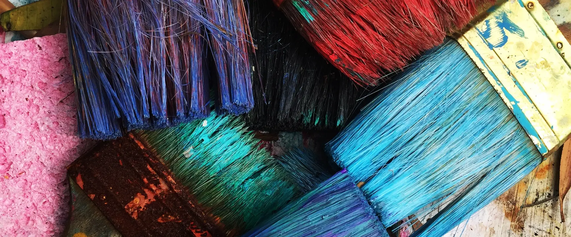
Trying to choose the perfect branding colour palette?

You’re in the right place.

We all know the importance of colour for branding, but it can be an overwhelming choice.

Today we’re going to show you a great (free) colour palette generator. We’ll drop some tips to help you get the best branding colour combinations. We’re going to talk about primary and secondary colour palettes and how many colours you need. Finally we’ll find out what brand colours mean and get right into branding colour psychology.

Primary and secondary colour palettes.

Your primary palette is essentially those colours used in your logo. They’re usually 1-4 colours and these have the strongest connection to your brand. Your secondary palette supports the primary palette. These should be more neutral and compliment your primary palette rather than competing with it. You don’t want to outshine your logo.

How many brand colours should i have?

Depending on the needs of your brand, this can range. Including your primary and secondary palette, I would say a minimum of 5 and no more than a dozen. If you have sub-brands you might use more, but the more colours you have, the more you dilute your brand recognition.

What colours mean for branding.

Let’s talk about the psychology of your branding colours. Are you thinking about using a certain colour but not sure if it’s right for your brand? Wondering what colours mean? Check if your tone matches your vibe with these colour descriptions.

Blue

Green

Red

Yellow

Purple

Orange

Pink

Brown

Grey

White

Black

Blue

Statistically the most popular colour of the visible spectrum, blue is calming and peaceful.

Blue represents relaxation, communication, loyalty, business and security. Conjuring feelings of serenity, security and orderliness. This makes it a popular choice for corporate brands.

But blue can also portray feelings of sadness, especially when it’s not complimented with a warmer colour.

The colour blue causes our body temperature to drop, heart rate to decrease and produces calming chemicals.

Blue relates to self expression. Speech, communication, the ability to express our needs and requirements.

Blue is used in offices as studies show that it boosts productivity. People are reported to be able to be physically stronger in blue rooms, so gyms often paint their walls blue.

Although good in offices and gyms blue is not recommended for bedrooms as it can interrupt our circadian rhythms. During the day we see the blue sky so we associate it with wakefulness. This has a negative effect on sleep patterns.

Although popular, blue is the least appetising of colours. Some dieticians recommend eating off a blue plate to decrease your appetite. This may be because blue rarely appears in foods and is often a sign of spoiled food or poison. If you’re a restaurant or food brand, maybe choose another colour.

Green

Green is a diverse colour that contains many meanings for us and is second only to blue in popularity.

Green is most often associated with nature. It is the colour of growth and fertility, of health, renewal and healing. In the middle ages brides wore green to symbolise fertility. The word green has in fact been traced to the Old English word growan, ‘to grow’.

Islam venerates the colour green as their paradise is expected to be full of lush greenery and many cultures view green as a colour of wealth and prosperity.

Green is a restful colour, it is the easiest colour for the human eye to look at. Colour therapists often use green as a balancing colour as it is situated in the centre of the colour spectrum.

It is a very popular decorating colour for its calming effect. It is said that time goes faster in a green room and that people who work in green environments suffer less illness. Whilst waiting to appear on television people are sat in a green room to aid in relaxation.

Green can be used in times of stress to promote tranquillity. When feeling stressed try wearing something green or going for a walk in a park or garden.

The colour green also has a dark side, often representing envy or illness. Being green with envy or being assailed by the green eyed monster are common expressions. Looking green around the gills is a colloquialism for looking sick.

Inexperience is sometimes described with the word green. A horse that has just been broken to the saddle is referred to as green. The term greenhorn is used to describe an inexperienced person. This use of the word green may have come from green being the colour of immature or unripe fruit.

Green relates to the heart chakra. This chakra relates to love and self love, that is to say the ability to give and take unconditionally. When balanced we are able to give this love and also to love and nurture ourselves.

Green is the balance between the higher or cool colours in the colour spectrum and the lower, warm colours.

Red

Red is an intense colour with many strong associations to our emotions and traditions.

Said to be the most emotionally intense colour of the spectrum, red is not only used to describe our feelings but can in fact evoke them.

It represents rage and violence, excitement, love and comfort. It is the colour used predominantly on valentines day to portray feelings of love. But, ironically, it is also a colour very closely associated with conflict and anger.

It is the colour of blood making it a representative of death, although some cultures see it as representing life. From childbirth, rights of passage such as circumcision, hunting and eventually death, blood is present in all stages of life.

Studies show that being exposed to red actually raises our blood pressure and respiration rate. The same physical reactions we have when we are excited, angry or experiencing passionate love.

Red is used in restaurants to stimulate appetite. In decorating it is often used as an accent so that it doesn’t dominate too heavily. Red clothing gives the wearer the appearance of being bigger.

Red is a strong, powerful colour. Red is hot. Red is intense and it is happy. Studies show that men find women wearing red more attractive.

Red is used as a warning in stop signs and lights and is placed on hot taps to warn of temperature.

In China, red is the colour of happiness, luck and prosperity. Eastern brides wear red. In South Africa it is the colour of mourning. Communism is associated with red and because it is associated with power, red is used on many national flags.

Red relates to the base chakra. This chakra relates to physical identity, oriented to self-preservation. Located at the base of the spine, this chakra forms our foundation. It represents the element earth, and is therefore related to our survival instincts, and to our sense of grounding and connection to our bodies and the physical plane. Ideally this chakra brings us health, prosperity, security, and dynamic presence.

Yellow

Yellow is the brightest colour in our visible spectrum, it is cheerful and sunny.

In colour therapy yellow was thought to stimulate the nervous system, purify the body and speed our metabolism.

Although yellow is considered a happy colour, people are more likely to lose their temper in a yellow room and babies have been shown to cry more in rooms painted yellow.

Yellow is a very high energy colour, of all the colours it reflects the most light and therefore can be hard on our eyes. Yellow paper or backgrounds on computer monitors can lead to eyestrain and vision loss in extreme cases.

Although yellow is not recommended in large doses, it is a mentally stimulating colour. Yellow can activate memory and communication. Note pads and post-its are often yellow for this reason.

In Egypt yellow is the colour of mourning, and in England in the Middle Ages actors dressed in yellow to symbolise the dead.

On it’s darker side yellow has been used to convey cowardice and deceit. This is usually represented with a darker or greenish yellow. In contradiction, yellow in Japan represents courage.

Yellow relates to our Solar Plexus Chakra. This chakra is known as the power chakra and is our ego identity oriented to self-definition. It is located midway between the navel and the base of the sternum.

It represents the element fire an it rules our personal power, will and autonomy, as well as our metabolism. When healthy, this chakra brings us energy, effectiveness, spontaneity, and non-dominating power.

Yellow shines with optimism, enlightenment, and happiness. Shades of golden yellow carry the promise of a positive future. Yellow advances from surrounding colours and instils optimism and energy, as well as sparking creative thoughts.

Purple

Our third favourite colour, purple, is a rich and vibrant colour full of tradition and meaning.

Purple is historically a symbol of power. Purple dyes, before today’s mass manufacturing, were laborious and expensive to produce. This meant only the very rich and powerful could afford them and as a result purple came to represent royalty, luxury, wealth and power.

Purple togas were worn by the all powerful Roman Emperors and became the signature colour of the Ceasars. In medieval Europe it was the colour of royalty and could, by law, only be worn by the royal family. Even today, the Queen of England is most often seen in purple clothing.

Purple is used extensively in religion to mark important people or events. Christians use purple to represent Advent and Lent. In Tibet purple amethysts were sacred to Buddha. In Tudor Britain, violet was the colour of mourning, as well as the colour of religious fervour.

Purple is also considered a romantic colour. It is considered feminine and sophisticated. It has also been used to represent spirituality and wisdom. In fantasy wizards and witches are often depicted wearing purple.

Purple can be used to rebalance your life by calming you from stress and over activity or to soothe and energize from depression.

Painting a room purple can boost a child’s imagination or an artist’s creativity. But too much has been known to cause moodiness.

Purple relates to the Brow Chakra. This chakra is also known as third eye justify and relates to archetypal identity, oriented to self-reflection. It represents the element of light and is related to the act of seeing, both physically and intuitively. As such it opens our psychic faculties and our understanding of archetypal levels.

Orange

Orange is warm, exciting and enthusiastic. It stimulates creativity, productivity and communication.

It is considered a social colour as it stimulates conversation and mental activity.

Orange is said to increase oxygen supply to the brain and to heal the lungs. It increases energy levels, both physically and mentally. Also, as a citrus colour, it is associated with vitamin C and healthy food in general.

Orange is a colour of change, this meaning comes from the changing leaves of Autumn and the transformation from Summer to Winter.

Being such a bright colour, it is used extensively for traffic and warning signs as well as reflective safety clothing. Although orange draws attention by itself, in these situations, it is backlit with its complimentary colour of blue; the sky.

Orange can stimulate appetite and is used with brown as a colour representing Thanksgiving in America.

It also represents Hinduism, traditionally swamis wear orange robes. It is thought that it is used in Hinduism as it represents fire and the burning of their former selves, their ego and personal wants.

Orange combines the energy of red and the joy of yellow. A darker orange with more red in it can evoke feelings of desire and sexual passion, aggression and a thirst for action.

A lighter, more yellow hue projects feelings of warmth, happiness and even wealth as it is similar to gold.

Orange relates to the Hara Chakra. This chakra defines our emotional identity, oriented to self-gratification. The second chakra, located in the abdomen, lower back, and sexual organs, it is related to the element water, and to emotions and sexuality. It connects us to others through feeling, desire, sensation, and movement. Ideally this chakra brings us fluidity and grace, depth of feeling, sexual fulfilment, and the ability to accept change.

Pink

Pink is the colour of love and romance, joy and happiness. It it one of the only colours with no negative associations.

Pink can evoke feelings of calmness and relaxation. It is associated with tenderness and caring. Baby girls are dressed in pink.

Pink can carry the same high energy as red without the violent tendencies that colour can engender.

Wearing pink can strengthen feelings of self-love, contentment and acceptance.

Pink is known for its calming affect and is also known to lower energy levels and moderate turbulent emotions.

Love and romance are inextricably tied to pink, especially the lighter shades. It is said that this meaning was given to pink as it reflected the blush of a young woman’s cheeks.

In Japan the annual blooming of the pink blossomed cherry trees is said to represent young Japanese warriors who fell in battle in the prime of their lives. In a way this association is mirrored in western culture where the phrase ‘in the pink’ refers to the pinnacle of health.

Pink relates to the Crown Chakra. This chakra refers to universal identity, oriented to self-knowledge and consciousness as pure awareness. It refers to the element of thought.

It is our connection to the greater world beyond, to a timeless, spaceless place of all-knowing. When developed, this chakra brings us knowledge, wisdom, understanding, spiritual connection, and bliss.

Brown

Solid, reliable brown. It stands for the earth and is abundant in nature.

Brown can imply genuineness, strength and reliability. It represents steadfastness, simplicity, friendliness and good health.

Being such a wholesome and earthy colour, brown can evoke feelings of warmth and comfort, security and grounding.

It can also bring forth feelings of sadness and wistfulness. Just look at sepia photographs and you get the pang of nostalgia that brown can evoke.

Wear brown when you want to feel more connected to the earth, or just more grounded and stable. It can help you blend into the background, but is also sophisticated without the starkness of black.

Brown stimulates appetite. Its connection with feelings of warmth and health may be responsible for this. It gives you a sense of home and, by extension, wonderful home cooked meals. It may also be because brown is so closely tied to nature and the earth where all food comes from.

Thanksgiving in America is represented by brown along with orange. This holiday is to celebrate the harvest, so brown would be a natural choice.

In India, brown is the colour of mourning as it resembles dying leaves.

It can also have a negative side. The term brown nose describes someone who attempts to ingratiate themselves with people of authority for their own gain.

It has also been said that people who choose brown as their favourite colour may have repressed personalities. But brown lovers are also said to be conventional, orderly and dependable.

Grey

Cool, conservative and moody, although it is often over looked as a boring hue, grey is rich in meaning and visual impact.

Grey is a sophisticated colour, it represents maturity and age, sadness, intelligence, practicality and prestige.

Grey, being a tint of black, carries much of that colour’s meaning. Although many of the negative connotations are left behind.

Charcoal suits are part of the corporate uniform. They denote sophistication without sexiness and intelligence without the dark mystery and fear that black can engender. Light grey is a favourite colour for men’s suits on occasions such as weddings.

Grey is said to be the most neutral of all the colours and this fact lends itself to the perception of grey being a boring colour.

Undyed wool garments are generally some shade of grey. In the Elizabethan era the poor and junior priests wore these garments as they were cheap to produce. This gave grey an image of staid conservativeness.

Grey is the Christian colour for Lent. A time of prayer, penitence and self-denial.

As the colour of storm clouds, ashes and cobwebs grey is often seen as a spooky, moody colour. Ghosts and dusty, haunted houses are often depicted in grey to capture that mood.

On the other hand grey can be a very prestigious colour. Silver is used to denote expense. It also calls to minds kitchens and science laboratories.

White

White is rich in religious and cultural meaning. Whilst some would argue that it is not a colour, it inspires us and affects us as other colours do.

White means peace, cleanliness, freedom, purity and innocence.

White is a very interesting colour as different cultures view it in very different ways. Western cultures see white as peace and purity, but in the east it is the colour of death.

In most western cultures brides wear white to symbolise virginity and innocence. The white veil is also a symbol of this purity. In Japan brides also wear white but this is to symbolise the death of their old life and their old family and rebirth into their new one.

In many religions priests wear white. This is to represent that they are pure enough to enter the temple or church and carry out their religious duties. The Pope is always clad in white.

White is synonymous with Heaven, as it is imagined to be in the clouds where everything is white. People are reported to see a white tunnel during near death experiences and angels are depicted with white wings and robes.

Waving a white flag is a sign of peace, truce or surrender. A white dove is symbolic of peace in the Christian religion.

In Eastern culture white is symbolic of death. It is the colour of mourning and worn at funerals.

White is used in decorating to create a sense of space. Most hospitals, doctors surgeries and dentists clinics are painted white to create a feeling of cleanliness and hygiene.

Black

Although, like white, is said not to be a colour, black makes us feel like no other hue on earth.

Black is power, elegance, formality, death, evil, and mystery.

The colour of night, of vampires and witches, of the unknown and evil. Black can scare us with its mystery. It represents power, maybe this is why we fear and revere it.

Black represents death and mourning in western culture. It is worn at funerals and in some cultures widows wear black for the rest of their lives. Conversely, ancient Egyptians saw black as the colour of life and rebirth.

In fashion black is seen as sophisticated, powerful and slimming. It is the colour of choice for formal wear; black tie and the little black dress. It is also timeless and considered sexy.

In Eastern culture black is associated with wisdom and authority. In most martial arts the black belt symbolises the highest level of learning and skill.

Black usually has negative connotations and is associated with fear and the unknown. Think of black holes, the black market, black death and blacklists.

Black is seldom used in decorating, and when it is, it is only small details.

This is because black is the colour we see when a surface absorbs all light and reflects nothing. Because of this it makes a space seem dark and much smaller than it really is.


Photo by RhondaK Native Florida Folk Artist on Unsplash

Optimise Your Images For Web

Why should I optimise my images?

Google is picky about what they like, but we can agree with them on this one: site loading speeds. A fast loading website is prioritised in Google searches and your visitors will appreciate the experience too.

One key way to achieve this is optimising your photos.

What the heck does that mean?

Make your photos smaller! But not too small. You don’t want them blurry or pixelated.

This sounds complicated, I’m just going to upload straight from my high-def camera.

Nooooooo. Here’s a quick, free and easy way. I promise.

Watch this video to see what I do before I upload images to my clients websites. Detailed zinstructions are below if you need more of an explanation.

How to optimise images for web

in 10 easy steps

  1. Open Birme.net in your web browserWe’re going to reduce the amount of pixels (those are the little coloured squares that make up a photo) in your images. A photo straight off your camera might be four thousand pixels wide. We don’t need that many for web. Don’t worry, you won’t notice the reduction on your screen.
    Note: You cannot add pixels to a photo. If it’s only 200 pixels wide, making it 1,000 pixels with this (or any) tool will not improve the quality, visually.
  2. Add your photosClick the browse button and find where they’re saved, or simply drag your images straight from finder/windows explorer onto the site.
  3. Set the size of your images

    What size?

    This depends what the images will be used for. If I’m not sure yet, I tend to size everything to 1920×1080 pixels. Why? Because even if that image is full width on a large screen, it’s going to look good. If you have a lot of images and they don’t need to be full screen you might choose something smaller. For example, if you have a lot of images for a gallery you could save them all at 1200×700 pixels and save a bit of load time. If 90% of your site visitors are on mobile, even smaller images for faster load time could be more important.

  4. Adjust the cropYou’ll notice all the images now have an overlay showing where they will be cropped. You might want to adjust where this sits. Birme auto focuses where it thinks the image should be cropped, but it’s worth checking each pic to see that it’s right. You don’t have to crop your images, but this will build consistency on your site. For example, in a gallery, it’s quite annoying for the eye to register a different dimension image each time you click through. A consistent size feels nicer.
  5. Don’t add a watermark or borderThat stuff is a bit tacky, with a few exceptions. If you’re a photographer you may need to protect your images with a watermark, this is an easy way to add it. Borders are a stylistic choice. If you want your site to look like it was built in the 90’s, have at it!
  6. Adjust image Format and QualityThe recommended 80% for jpegs and 50% for webp files is just fine. If you know your website platform accepts webp, select webp. This is a newer filetype specifically designed for web. Google likes it (they created it) and it allows more compression with less quality loss. Some web builders don’t yet accept this format though.
  7. Rename your files

    Why?

    This is a really cool feature to boost your SEO. Basically use your best keywords to name all of your pictures. For example, if you’re a scuba company in the Whitsundays, you could use the name scuba-dive-whitsunday-islands-xx. The Xs represent the numbers that will be added after each image to create a unique filename.

    But they should have unique names according to what they are, right?

    Ideally yes. If you’d like to name them all individually, have at it! If not, this is better than IMG_321.

  8. Download your filesChoose if you want to download them individually or all in a zipped folder. If only one file downloads, check if there’s a small error window from your browser asking if it can download multiple files.
  9. Open TinyPNG.com in your web browserNow that we’ve reduced the amount of pixels, we’re going to compress them a bit! Drag your (recently resized and renamed) pics into the window or click Drop your WebP, PNG or JPEG files here! to browse to them in your computer.Note: Don’t use the originals, make sure you use the ones we just downloaded from Birme.Panda will compress the files and give you a percentage on how much he reduced them.
    Fun!
  10. Download your files, againOnce again, you can click each one to download individually or do them all as a zipped file.

    That’s it!

    Your files are ready to go and won’t clog up your site with copious pixels!

    But Kate, my photos are already on my site and it’s a lot of effort!

    Head over to Google PageSpeed Insights and enter your web address. Scroll down to Opportunities and see if image size is mentioned. If Google is rating it as a big problem, it might be worth doing! If not, just do thisas you add more photos. As your site grows your load speeds won’t.

Cyaround Australia Tours

Here’s a website I recently redesigned. I used this method to optimise their new photos and images. This is a website that uses a lot of imagery to showcase their incredible experience in the Northern Territory. But it’s important that load speed doesn’t affect their visitor experience. Check out the
case study here and if you’re planning a trip to the NT, book in with Storm and Jack for a one-of-a-kind experience!

The scuba photos I used for this tutorial are by Sebastian Pena Lambarri on Unsplash. Unsplash is an excellent resource for high quality, free stock images. You should credit your photographers though, like I just did!

Photo by KOBU Agency on Unsplash

I hope you enjoyed this tutorial, see you next time!

Visual Marketing Strategy

New year’s resolution: Get my visual branding on point!

But how?

Let’s look at how you can create a visual marketing strategy that connects with your audience and then I’ll share some practical tips and tools so you can make it happen.

And why?

Visuals are to your marketing plan what denim overalls are to the 90s—pretty darn significant. And just like that trend comes back again and again, I can’t stop emphasising how important this is.

In the internet world where chunks of text are just too much, visuals come to the rescue. They can help you build upon other elements of your marketing strategy and make an impact with your audience.

What is a visual marketing strategy?

It’s a comprehensive and effective plan that incorporates images, videos, and other visuals to connect you to your customers.

The idea of a visual marketing strategy is to create an impactful, memorable impression that helps you stand out from your competitors. With attention spans at an all-time low—8.25 seconds (and that seems long compared to mine!), strong visuals are crucial to your marketing success.

How to create a visual marketing strategy

Some simple steps to create a gripping visual strategy that wows your audience:

Establish your visual identity

To create a truly strong digital presence, you must focus your efforts on aligning your campaigns with your brand’s identity.

This means you need to create content that is in line with your logo, colours, typography, shapes (visual cues in your brand that distinguish you from others with similar branding) and imagery.

Any incongruence will lose you one of those crucial customer touch-points due to poor brand recognition. Sales research suggests a service-based business needs 8 of these before an initial meeting. Don’t lose one because you didn’t use your company colours!

Always share your brand kit with anyone creating your visual content. If you had a professional brand designed, you should have been given files and guidelines in your branding kit. If you created your own brand or logo, make sure your Canva brand kit is up to date so that you use your imagery consistently.

Match the tone

While it’s easy to follow every passing trend, you’re probably better off steering clear of anything that doesn’t go with the tone of your brand. The media you choose should ideally elevate your value proposition across platforms. If it doesn’t resonate with your brand, skip it. There’ll be another trend right around the corner.

Utilise user-generated content

Also known as UGC marketing, this part of your strategy can help you share visual content from your audience in the form of social media posts, web content, testimonials, and more. It lends an authentic voice to your brand while also acting as social proof for potential customers.

If someone posts something about you that’s awesome and on-brand, share it!

Analyse competitors

When you want to know which direction to take your strategy, one of the best things you can do is look at your competitors.

By performing a SWOT analysis on other companies, you can get an idea of what elements work and what opportunities might be available. Additionally, identifying areas where your competitors are lacking gives you the opportunity to capitalise on those weaknesses.

Consider customer journey

Since your audience makes up the heart of your marketing efforts, it is critical to understand their journey with your brand. Here is how you can achieve this:

  • Create a buyer persona (Bob from Brisbane who loves burritos and The Broncos)
  • Understand their preferences and purchasing habits (Shops online, buys impulsively for small stuff, researches his big purchases).
  • Formulate an authentic narrative that forges an emotional connection with them (Ripper Bob, here’s your Broncos stubby coolers and bottle opener, the boys are going to love it when they come over for the game on Sunday).
  • Strategically place visuals across your website and social media handles that increase the likelihood of a conversion (“I keep seeing that stubby cooler, I’m starting to think beer will taste better in it,” mused Bob)

When your visuals are well-placed and carefully curated, you not only come across as an authoritative figure in your niche but you also guide your customers in their journey to make a purchase.

Create for your audience

A sure-fire way to succeed with your visual strategy is to use imagery that is created for your audience.

Think about what they like (and not what you like) when creating your visuals. Regardless of the platform you’re creating for, remember to to it for your audience.

Practical tools and tips for execution

So we’ve given you a bunch of theory, but how can you make this happen? Here are some tools we recommend.

Coolors

Need to choose colours and don’t know where to start? This is a fun, free web app that might help. You can upload your existing logo to extract your brand colours, then use the Generator to choose some great shades for your secondary palette. If nothing else, this is a fun app to use and you’re not starting with an empty canvas, so have a play and see what comes out!

Canva

This is a powerful design tool that anyone can use. The base version is free guys, it’s a no brainer, check it out. If you upgrade you can use the Brand Kit and take backgrounds out of images and other cool stuff.

A folder on your cloud drive

This is underrated. If you don’t want to pay for Canva, you should at least have all your brand assets in a folder. Use your choice of cloud storage (iCloud, Google Drive, Dropbox, etc) so you have it wherever you need it and can share it with others. It should include:

  • Your logo in all formats and filetypes
  • Your fonts
  • Any photos or videos you use regularly
  • Your colours (your exact colour codes, not “blue”)
  • Profile images and cover images for social media

If you’re wondering how to store your fonts and colours, create a text document and paste in your colour codes (see coolors) and list your brand fonts (and make sure these are . This will help you keep consistency and not just use whatever when you’re putting visuals together.

Planable

This is a scheduling tool for your social media. Once you’ve designed a bunch of awesome (and consistent!) content, schedule it all here in one fell swoop so you don’t need to think about posting every day, to multiple platforms.

A Designer

Depending where you are in your business journey, it might be worth investing in a professionally designed brand. They will take the guesswork out of making the right visuals for your audience and you’ll get a kit with everything you need for visual success. You can chat to us at Rove if you think it’s time to make this move.

Ace your visual marketing strategy

Look at brands that dominate social media and you’ll see they have something in common—they understand that visuals are much more powerful than text. And with the rise of social media, it’s easy to see how imagery has revolutionised the way people share, engage and learn about brands.

Whether you’re looking to grow your brand’s presence, increase engagement or pull in more online sales, visual marketing is your golden ticket.

Photo by Perchek Industrie on Unsplash